
Comparing PE Ratio of Sensex & Nifty
For a long time, we looked at only one Index when it came to the Indian Markets and that was the Sensex. Even years after Nifty had come into the picture, Sensex reigned supreme. While Bombay Stock Exchange is the oldest exchange in Asia, when it came to the Sensex, the whole concept is fairly recent having been first compiled in 1986, more than 110 years after it was founded.
But with derivative trading in Nifty taking precedence, Nifty is the key Index most participants look at. While we have seen Sensex too becoming available for trade, the first mover advantage has meant that Nifty has virtually steam rolled over it.
When it comes to analyzing how expensive or cheap the markets have been, I have most of the time stuck to Nifty since NSE has made the download free and easy. But today I decided to update my Sensex PE and the variation was very interesting to say the least.
First out, here is the updated Nifty Price Earnings (trailing 4 Quarters, Standalone) chart with long term average and standard deviations
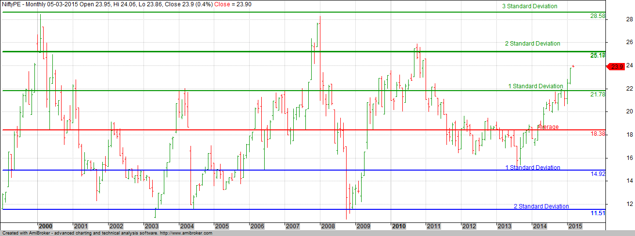
NSE provides data from 1999 and the calculation suggests that we are closing on to the peak valuation of 2010.
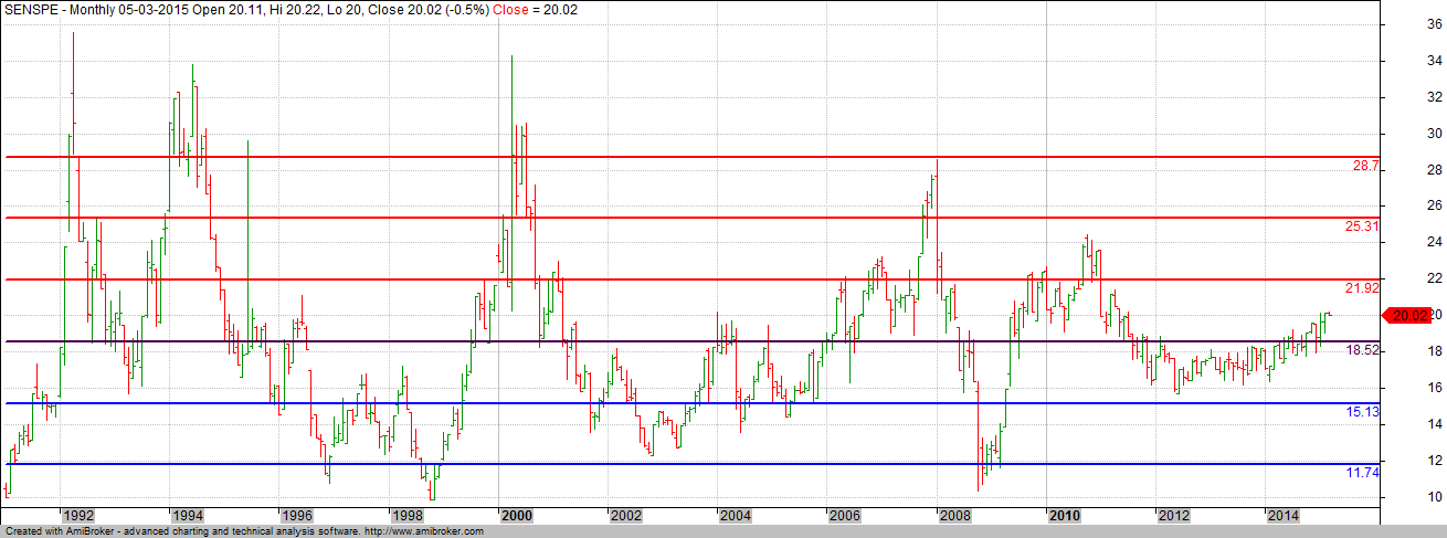
Theoretically speaking, the Sensex PE should show a similar number despite the fact that it has lower number of stocks compared to Nifty. But Sensex Price Earnings number seems to suggest that the market is not all that expensive. A caveat here, While I downloaded the Sensex Price Earnings number from its website, I could not gather as to whether the same is based on Consolidated numbers or Standalone and that in itself can make a difference.
What is interesting is that sector weights aren’t too different from each other. Below is the sector weight charts for both Nifty and Sensex.

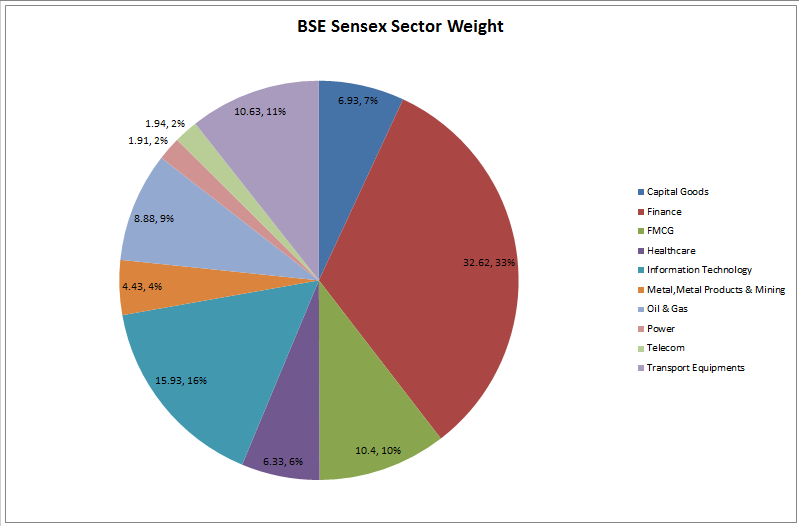
As you can see, the difference in weights is not so much as to impact the net valuation on a big time.
To better understand the moves of Sensex PE Ratio and Nifty PE Ratio, here is the chart of them combined (Relative Comparison)
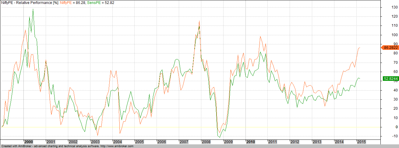
One of the things that is straight away visible is that while they have more or less moved in sync in the past, this time around, Nifty PE Ratio has shot up more substantially than that of Sensex.
And here is a Relative Comparison chart of Nifty & Sensex

And finally, a ratio chart where I divide Sensex with CNX Nifty

What the above chart shows is the points Sensex moves for every point on Nifty. Since 2001, this has been in a broad range.
Personally, I would stick with the NSE Price Earnings Ratio but it would be interesting to know why we are seeing this sudden difference in the Price Earnings of Sensex vs Nifty. The difference lies in a few company results, but it would be interesting to know which of them have actually caused this action.

The Nifty PE is standalone, It’s based o standalone EPS. But so is the Sensex PE. Have been observing how the nifty PE has taken off inline with the index, but the Sensex PE not moving much in spite of the index moving higher. Its intriguing!