Hidden Bias in Chart Reading
I am not a great fan of Chart Reading. Its like evaluating a painting, I may like one style and you may like another. Even technicians admit that what they see may not be what the other guy sees and since the probability of being right or wrong is always 50%, its no wonder that some one has to right and that in itself is shown as the reason why chart reading is a great asset to trading.
Biases are unfortunately ever present when it comes to skills where you cannot prove it to be wrong or right. Hence while everyone has to agree that 10 + 10 = 20, a single chart maybe read in any number of ways depending on what the chart reader assumes it to be showing / implicating at that moment of time.
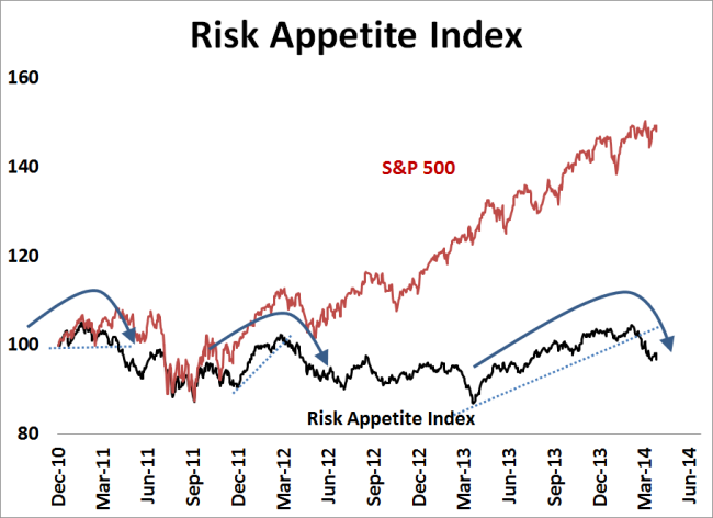
For example, look at this chart picked from here.
The author uses the chart to explain why his bearish bias is correct by showing how the Risk Appetite Index has broken a trend line and indicating a reversal of the current trend. But is that the correct way to read the chart?
The Index has twice dipped strongly. The first time was in June 2012 and the same has been marked. But that was the low for the market (and in hindsight, for the foreseeable future). Second was even more of a deadly drop in March 2013, but Index seemed to care a boot as it accelerated upwards through the year.
No strategy has a 100% win ratio (other than Bernie Madoff ofcourse 🙂 ), but unless its thoroughly tested and its faults known, one is better off not using / knowing such a strategy rather than use something that just feeds our bias regardless of it working or not.


Recent Comments