
Correlation between Nifty and Sector Indices
Over the last 6 months, it has been quite evident that even as the Nifty is booming higher, not all sectors are participating with it. IT which had a real good run has been on slipping quite a bit. So, the question is, what sectors are driving the current rally. As you can see in the correlation matrix below, the best performance has come in from Services sector and the Finance Sector. While IT leads the laggards, Media sector too has not had a great run.

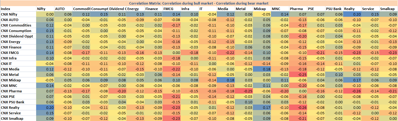
The best way to use this sector matrix is to compare how the sectors behaved during a bull run and how they performed during a bear phase and then use the same to allocate accordingly. Lets for a start see the correlation between the same sectors and Nifty when shit hit the fan and markets slumped down during 2008

The surprise for me was the low correlation of Small Cap with Nifty. This despite the fact that taken on just values, small cap fell more than what Nifty did. But as my good friend, @Jace48 tells me, its the order that is important rather than the overall change and hence the low correlation. To test this a bit further, I created a 20 day running correlation between the same (same set of dates) and the chart below points out to how the indices did not trend in a similar way.

And this is how the same sectors performed during the pull-back we saw in 2008 / 2009 (exact dates being 06/03/2009 to 06/01/2010).

And finally, lastly but not the least, Correlation during bull market – Correlation during bear market
While I was working on ways to present the data I had compiled, the above presentation was based on a article I found on bespokeinvest

Recent Comments